Restauración
Restauración Church is a non-denominational Christian evangelical church with South-American roots based in central London, England. Restauracion provides a plethora of services including weekly church services/gatherings, community aid and outreach, teaching for kids, tutoring and learning for youths and young adults as well as discipleships, advice and counselling for men, women and couples, music theory practice and live performance services amongst other things.
Restauración or restoration in English - refers to the action of returning something to a previous state. In this instance, restoring mankind's relationship with God. This concept was very significant to the client and led the development of the Restauración brand and visual identity. It was reflected primarily through the main logomark. A deceptively simple design was employed, mainly composed of an undulating stroke that forms a circle, with a gap in between to highlight the beginning and end of the path. The expanding stroke portrays the start of a renewed relationship between a person and God. The various undulations along the stroke represent the ups and downs a relationship with God brings. And lastly, the stroke's thinned end near the start point represents the change of self into one aligned with God's will, fully restored in a relationship as part of a cycle. The circle mark was accompanied by modified high-contrast, bold sans-serif script typography, it provides the logomark with a hint of charisma and puts the reader at ease. Lastly, to help the logo with recognition rates, a subtle visual cue was integrated into the typography - a simple yet distinctive cross silhouette made up of two bold strokes with a small shadow at the intersection where they meet. This simple symbol-design doubles as the 't' in Restauración and further affirms the theme. The cross silhouette was also made to work alongside the circle mark, together, standalone from the main logomark, to be an alternative/accompanying asset that can be used in settings where size and layout restrictions may be involved.
Other project elements were also designed including stationery, social media assets, a brand rules and guidelines document and accompanying visual language elements to keep the visual identity flexible across various contexts.
The client's old logo (top, left) was no longer suited to their needs for growth and differentiation in the community/market, and it was apparent that a new design direction could help to identify Restauración as a different type of organization.
A discussion that started when putting together the brief for the project highlighted the many services the organization provides and therefore a need to design a solution for each of these. One that would provide each with their form of identification. With this in mind, the relevant elements to be provided with a means of identification were pointed out and ideas were brought forward.
It became apparent that Restauración had a lot of elements that needed identification. So, a system to help with differentiation and recognition of each service was necessary. A visual language was created and implemented by broadly using one of the design components of the main logomark across all the relevant services as well as distinct typography. This system bestowed each service or ministry with its unique visual cue and style which allowed it to set itself apart while still visibly being recognized as part of the Restauración family.
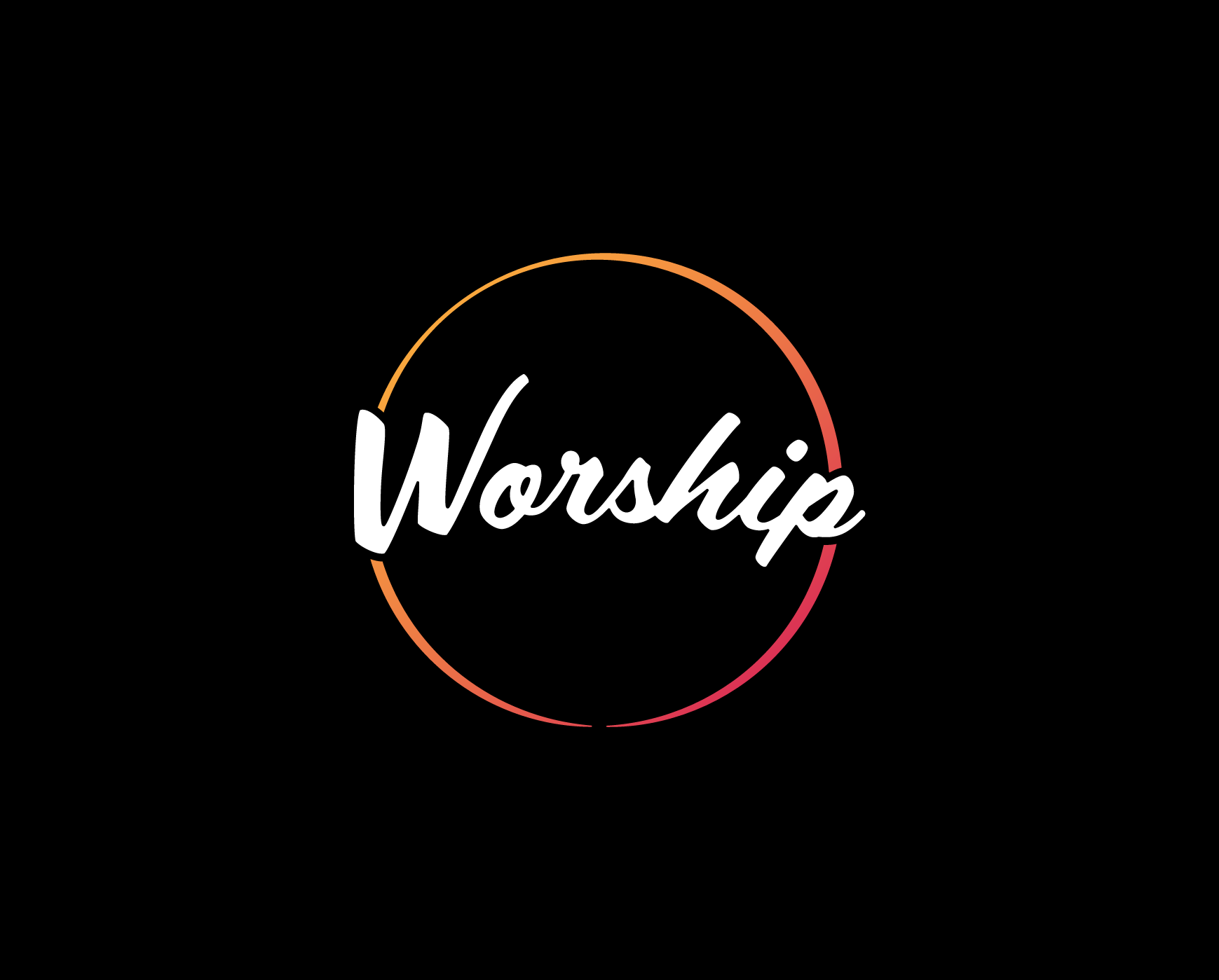
Designs were developed for each of the services' names. These were coupled and incorporated into the Restauración circle to become new compositions. They all shared a similar typographic style and so to create further differentiation between each of these, colour was introduced as a means of visual distinction. The vehicle for this new layer of personalised identification was the Restauración circle itself. Different sets of colours and graphic styles were used as identifying treatments for each of the different services, allowing for different personalities yet all being recognizably part of the same brand.


Client Feedback
Where to start, Abraham was outstanding. His patience and tactfulness in explaining the branding process and his constant responsiveness to feedback iterations and modification enquiries were a delight to experience. We discovered Abraham through a Google search, and what joy, from the moment he reached back to us with his proposal after examining our requirements, he immediately grasped what our problem was, pitched an appropriate solution and was always perceptive and friendly — never lacking for passion with what he called 'thinking through design'. We learned a great deal from him. He helped us achieve the outcome we wanted for our brand and we are all very proud of it. We will continue to seek his advice and collaboration for future projects.
- Edward Fuentes, Lead Pastor, Restauración
