Simple Data
Simple Data is a leading provider of analytics, decision science solutions and training courses for businesses and consumers, they mainly help businesses overcome operational challenges, reduce costs and improve performance. With recognition in the UK and internationally as renowned training providers the company based in Milton Keynes needed help with the development of their logo and visual identity that had to match their ambitions for upscaling.
'Simple Data' relates to the process of rich-data gathering, that is to make something that was once complex and unusable into something more accessible and easy to utilise. The concept of simplification was essential to adhere to and therefore had to be reflected through the logo firsthand. The design was to be kept simple in appearance to improve recognition rates while also being distinct and meaningful enough - so subtle visual clues were baked right into the logotype, primarily through the use of bold, clear and minimal typography and also through merging of the 'I' and 'M' letters of the word 'Simple' - simplifying further that which was already simple, to begin with.
Through earlier discussion, it was highlighted that the company also wished to make others aware of their capabilities as providers of data visualisation services and training. With this in mind, the 'a' letters within the word 'Data' were sectioned at key areas to be made to look like pie charts thereby merging both concepts of simplification of complex data and data visualisation training and services.
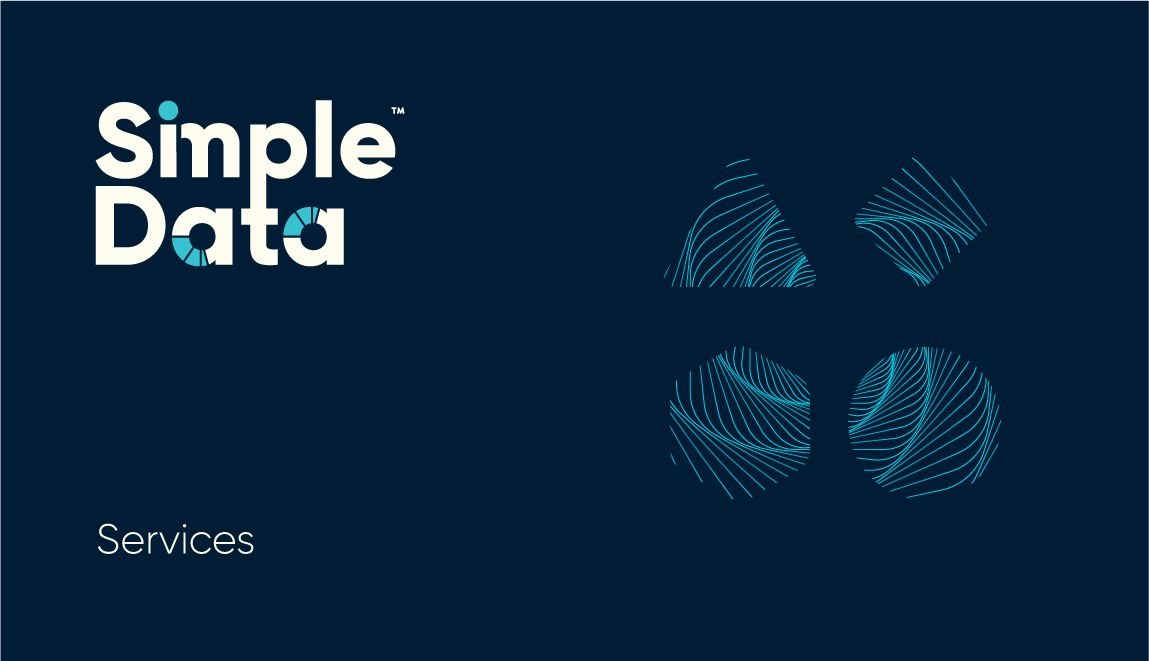
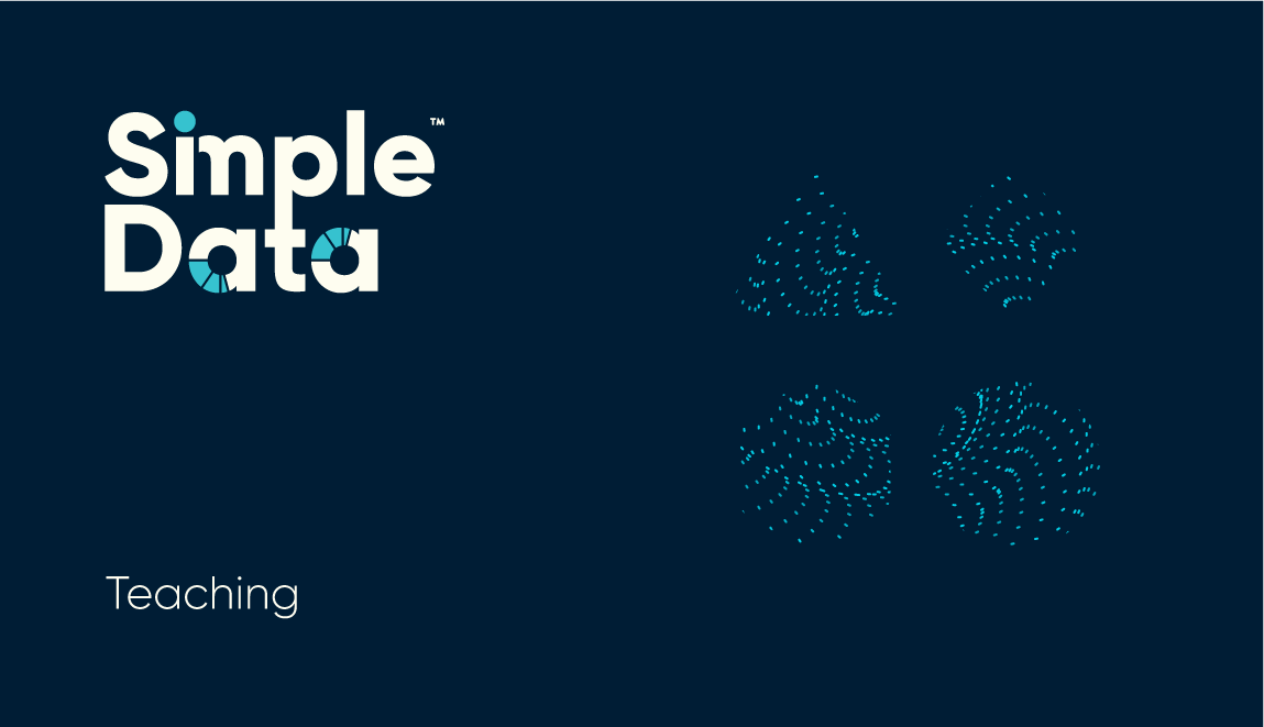
It became obvious that Simple Data had a lot of services to promote. A system to help with differentiation and recognition was necessary - also one that would aid the company with a multi-platform presentation. A visual language was created and enacted through a secondary accompanying logo mark, this system bestowed each service its unique design and style while remaining part of the family of Simple Data services.
The accompanying logo mark can be used individually from the main logo in contexts where size and layout restrictions are present. It is primarily composed of simple shapes, each promoting a different aspect of the company, together forming the analogy of data simplification - Triangle top left moving from left to right until we arrive at the Circle (the triangle signifies the simplest state of data while the circle is the most complex). Different set colours and graphic styles are used as identifying treatments for the logo mark - each highlighting a specific service or area of the company.
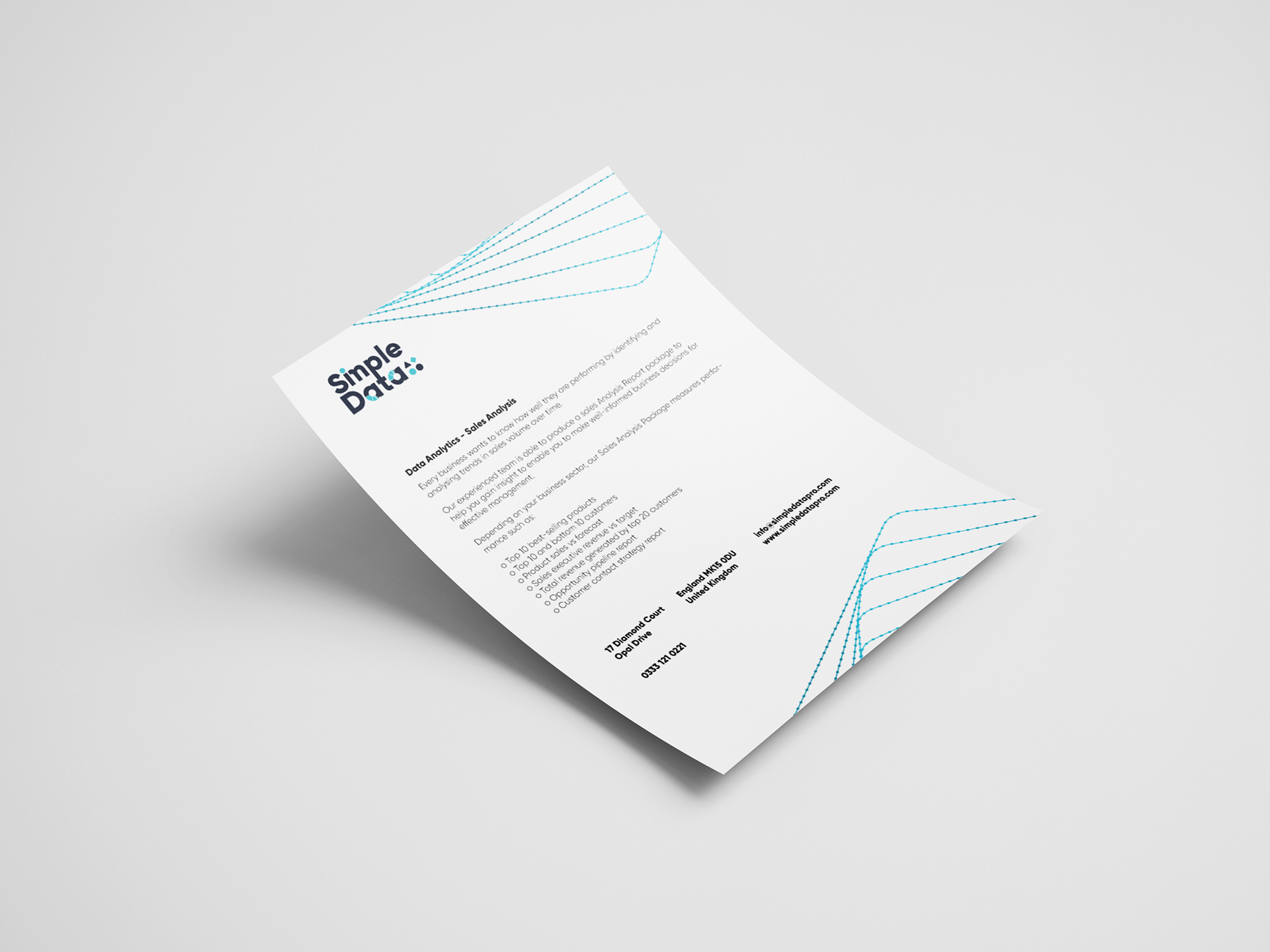
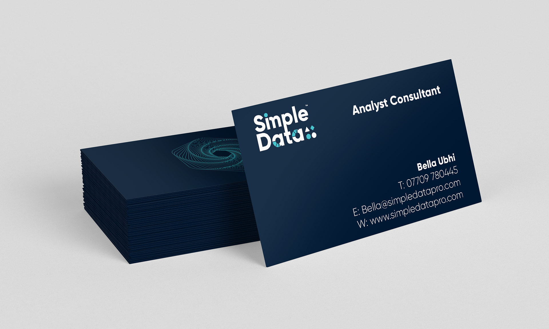
Other project elements were designed also, stationery, posters, social media assets, email blasts, a new company website and accompanying visual language elements to keep the visual identity fresh across various platforms.


Client Feedback
We'd been searching around for someone to guide us with our brand creation process and we tried a couple of designers but no one seemed to know how to approach our particular needs as a brand with a number of different services and sectors — until we found Abraham. From the moment we reached out to him to the very last step of delivering the assets, Abraham was super professional and always went out and beyond, his passion for design was clear from the start and at every step he eloquently explained every decision he made with the solutions he proposed to us. He took great care of us and we look very much forward to working with him in future once more.
- Bella Ubhi, Director, Simple Data
